Oh, hey! Show. Don't tell.
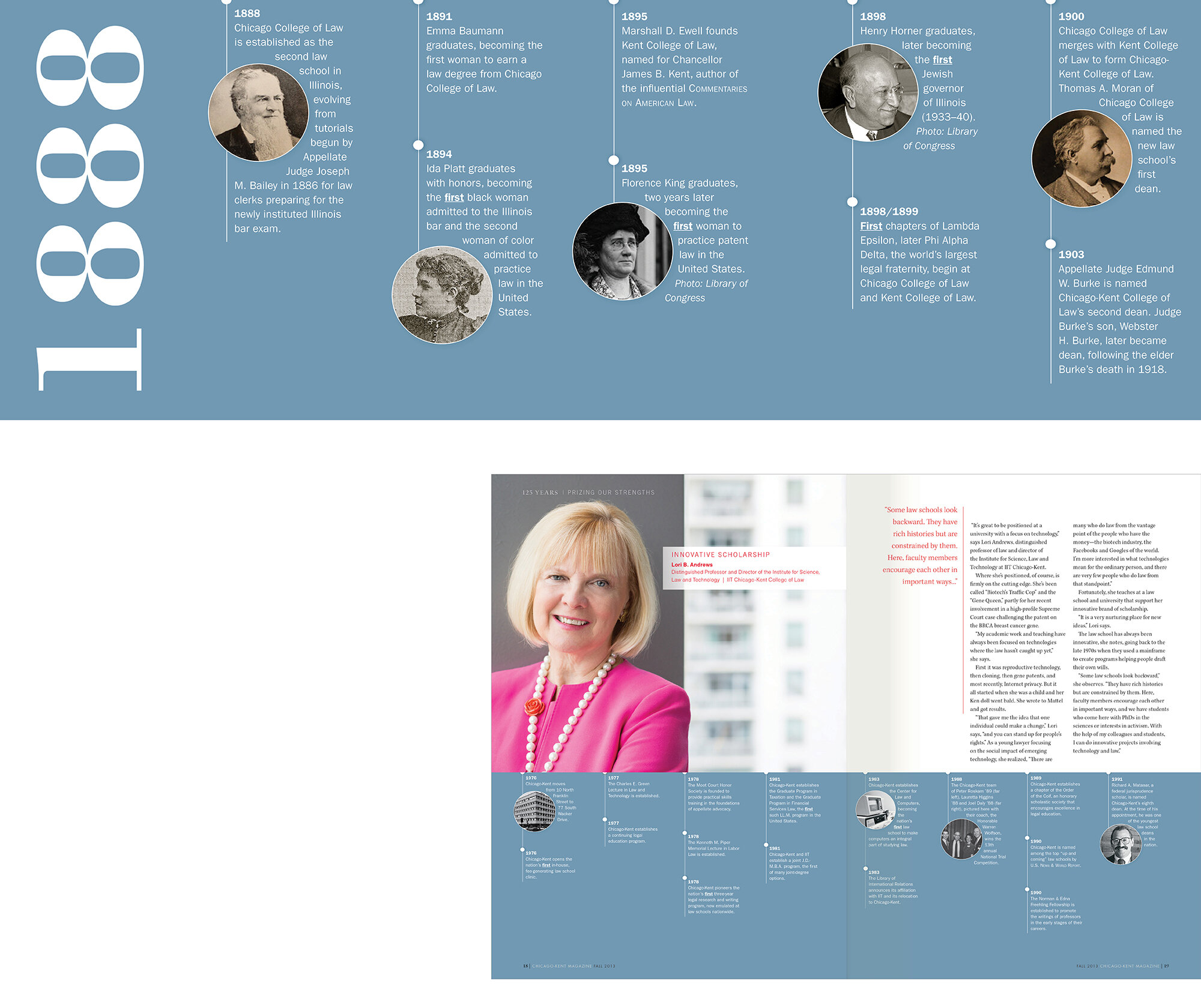
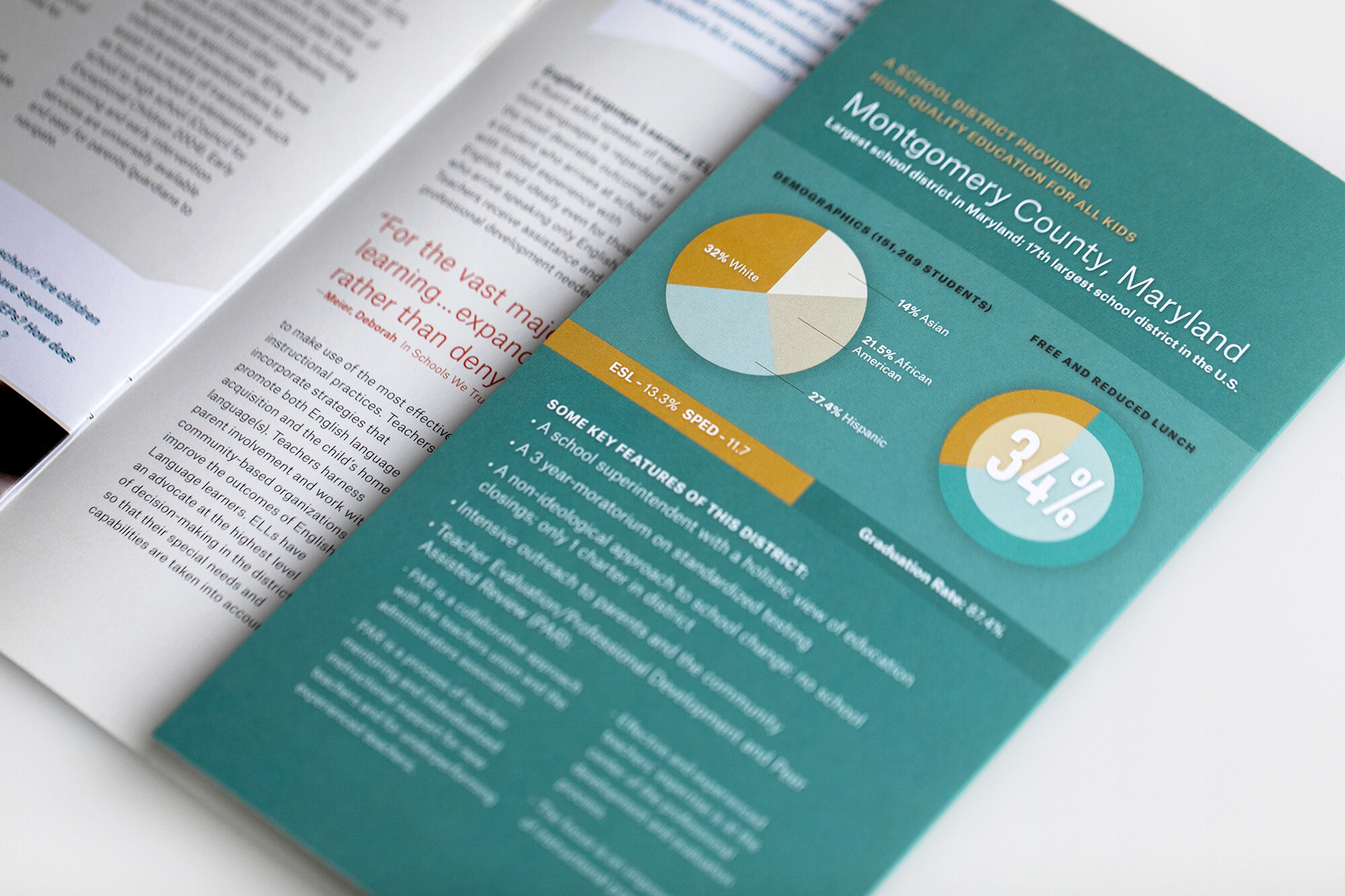
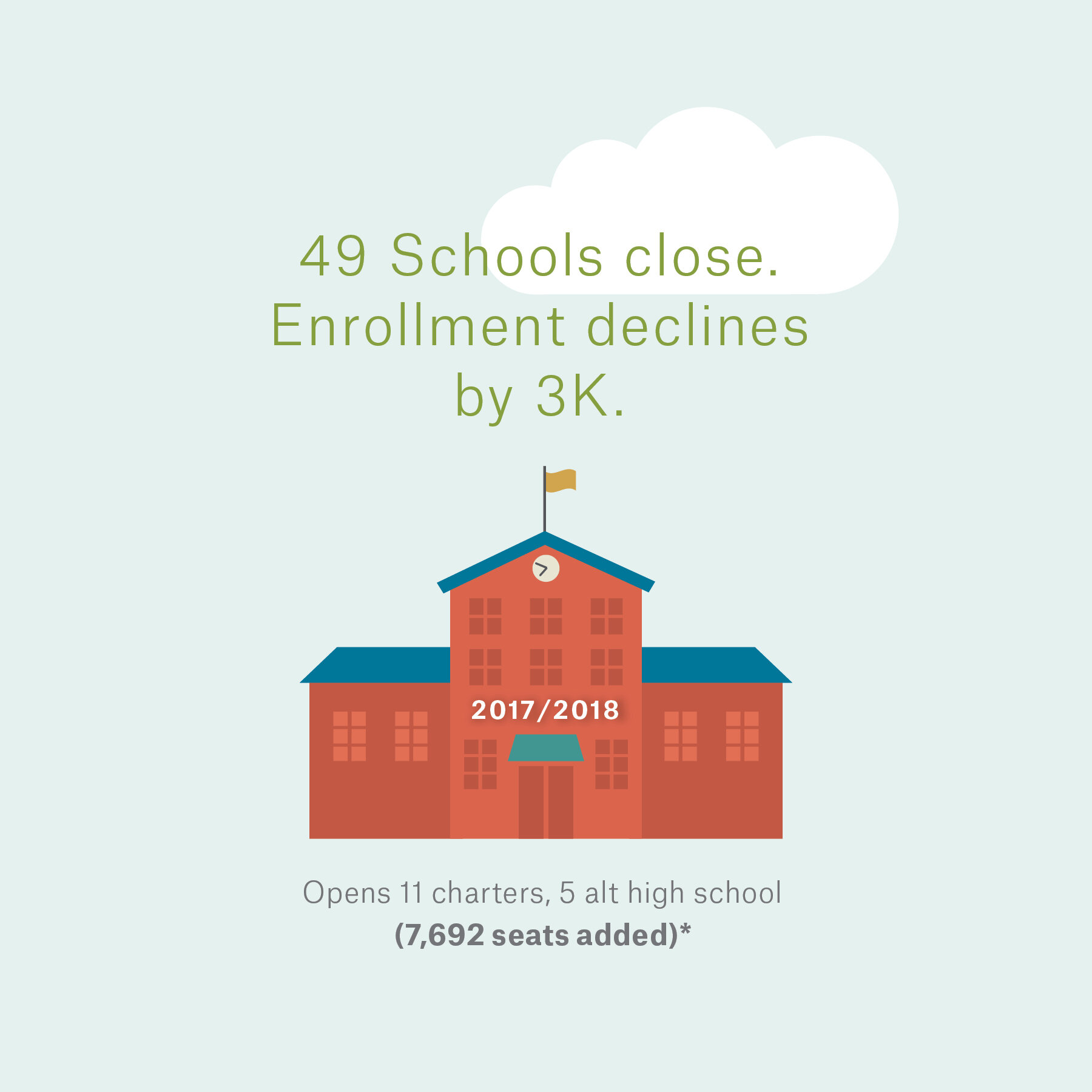
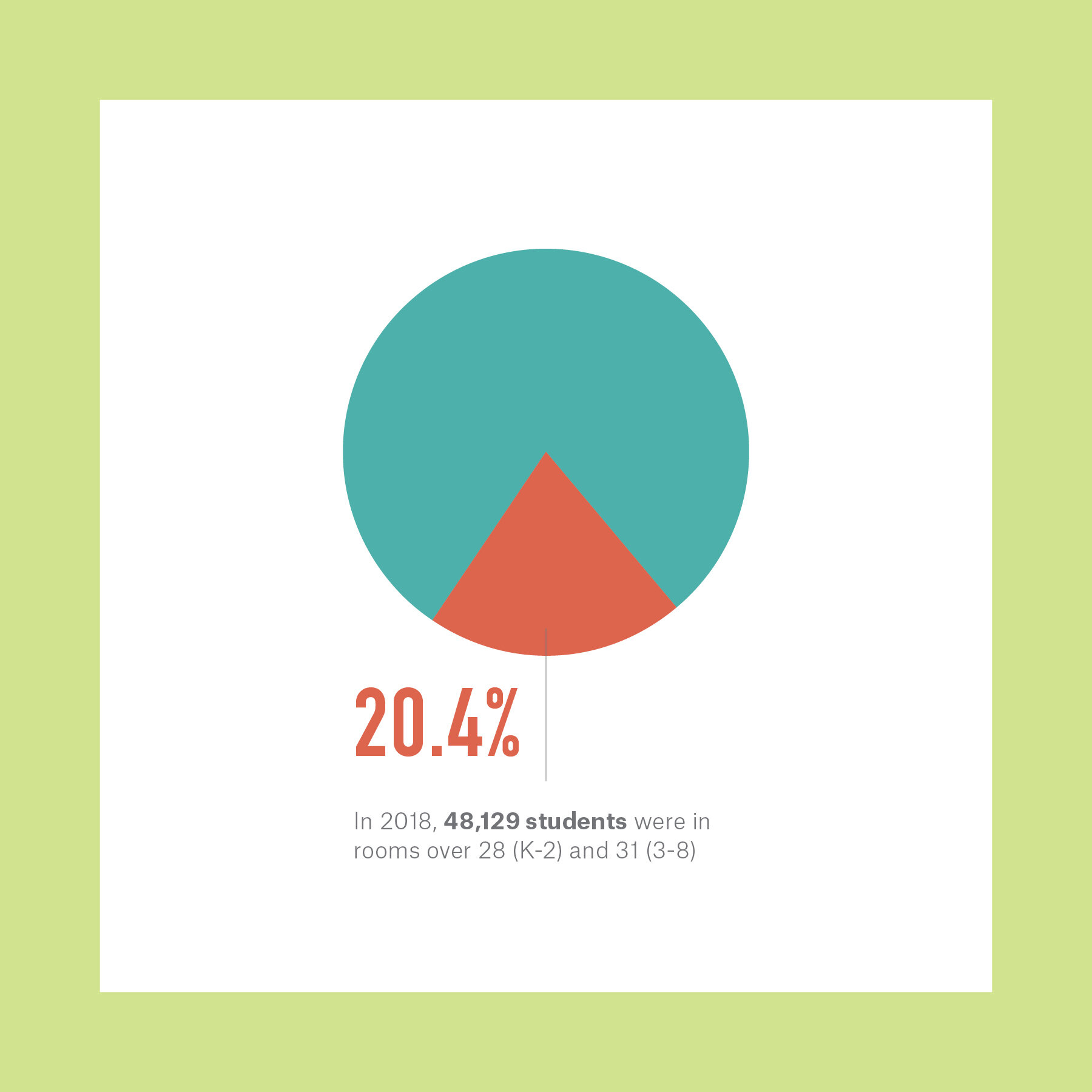
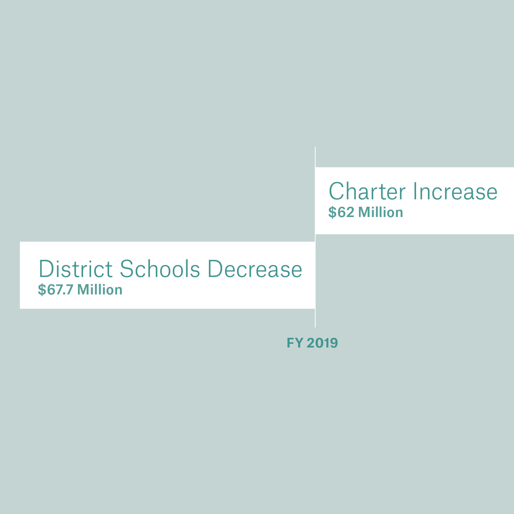
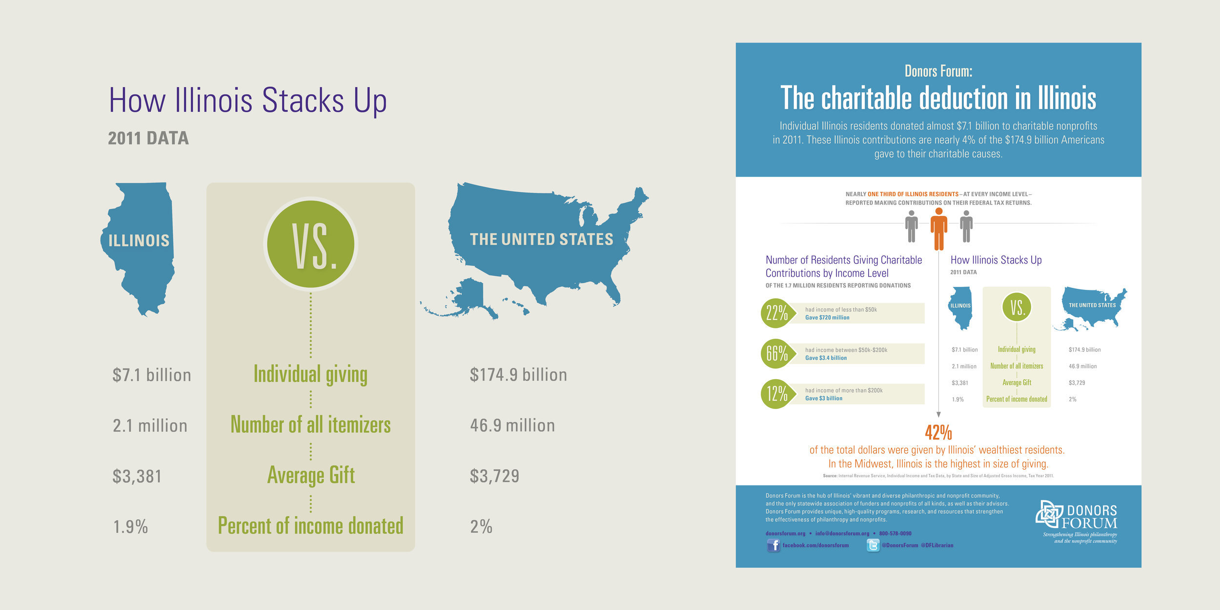
We often get inquiries to see if we design infographics. The answer is always absolutely! At Forward, we are firm believers in creating visuals to help support your content and to make it clear to your reader. Making content easier to understand is the name of the game and we are big fans.
Hold on to your iPhones, this is going to be a long one.
The brief
Information Design is always a fine balance of thinking about where it will be viewed, how the graphic will be used and what the client is trying to say. When starting an infographic, our main goal is always to filter to the helpful bits of data that tell the story. This isn’t new to us though... good content hierarchy is at the root of all that we design. A good infographic should be simple and straightforward. It should be intentional, specific and to the point.
This all might seem obvious, but it really is a delicate balance that we enjoy figuring out for our clients!
“When you think about it, it really isn’t far off from what we always do at Forward: telling your story. There are many ways to reach an audience; whether with words, illustration or photos, and distilling that is the heart of everything that we do here. Really.”
A plan for Chicago!
LISC’s Quality of Life Plans help form a better Chicago. Making social change in the community is what it is all about for them and a mission we like to get behind ourselves here at Forward.
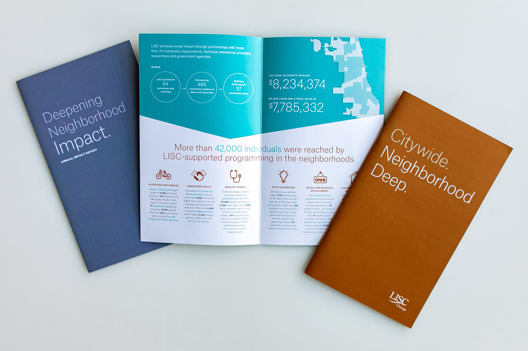
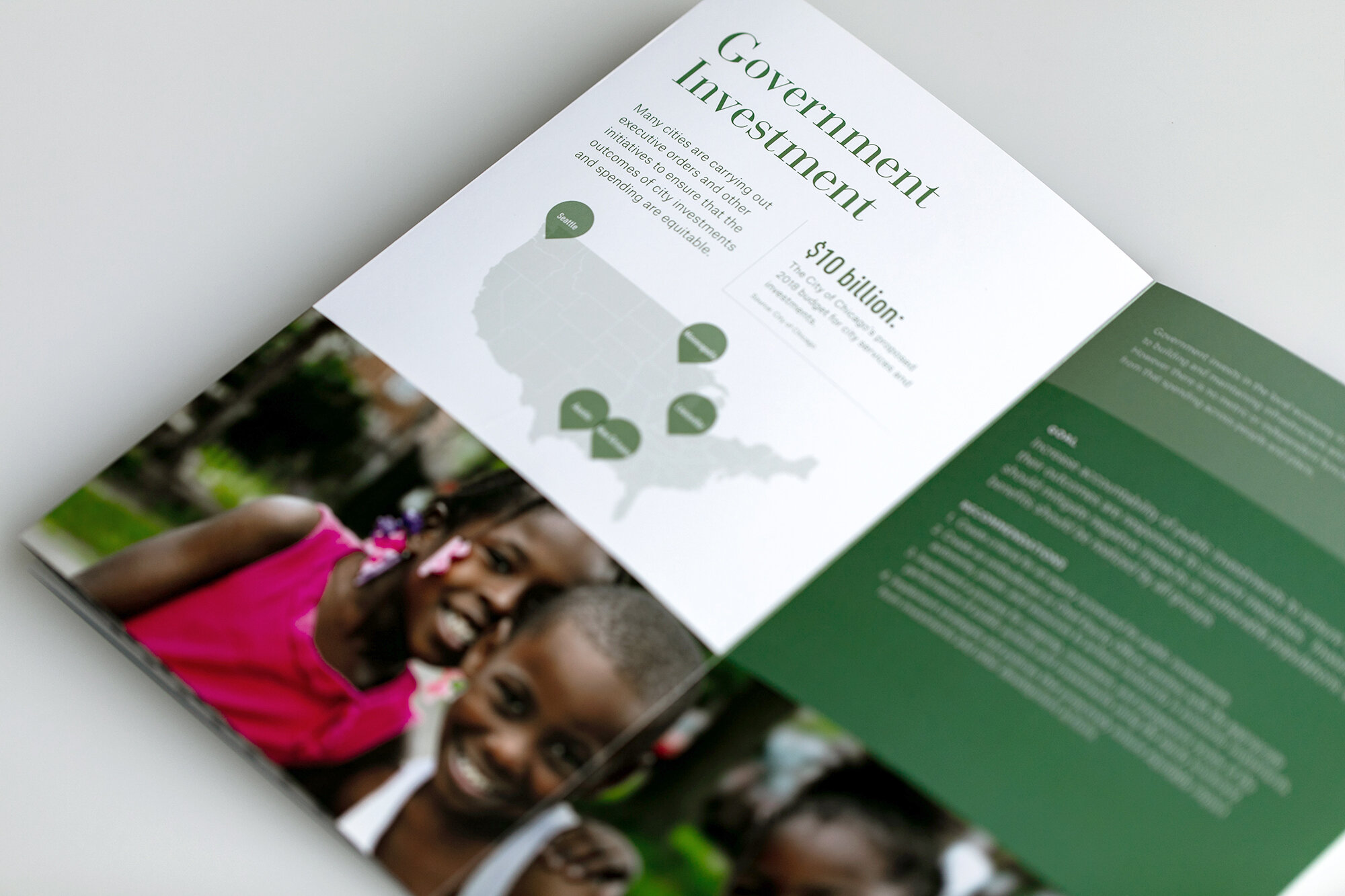
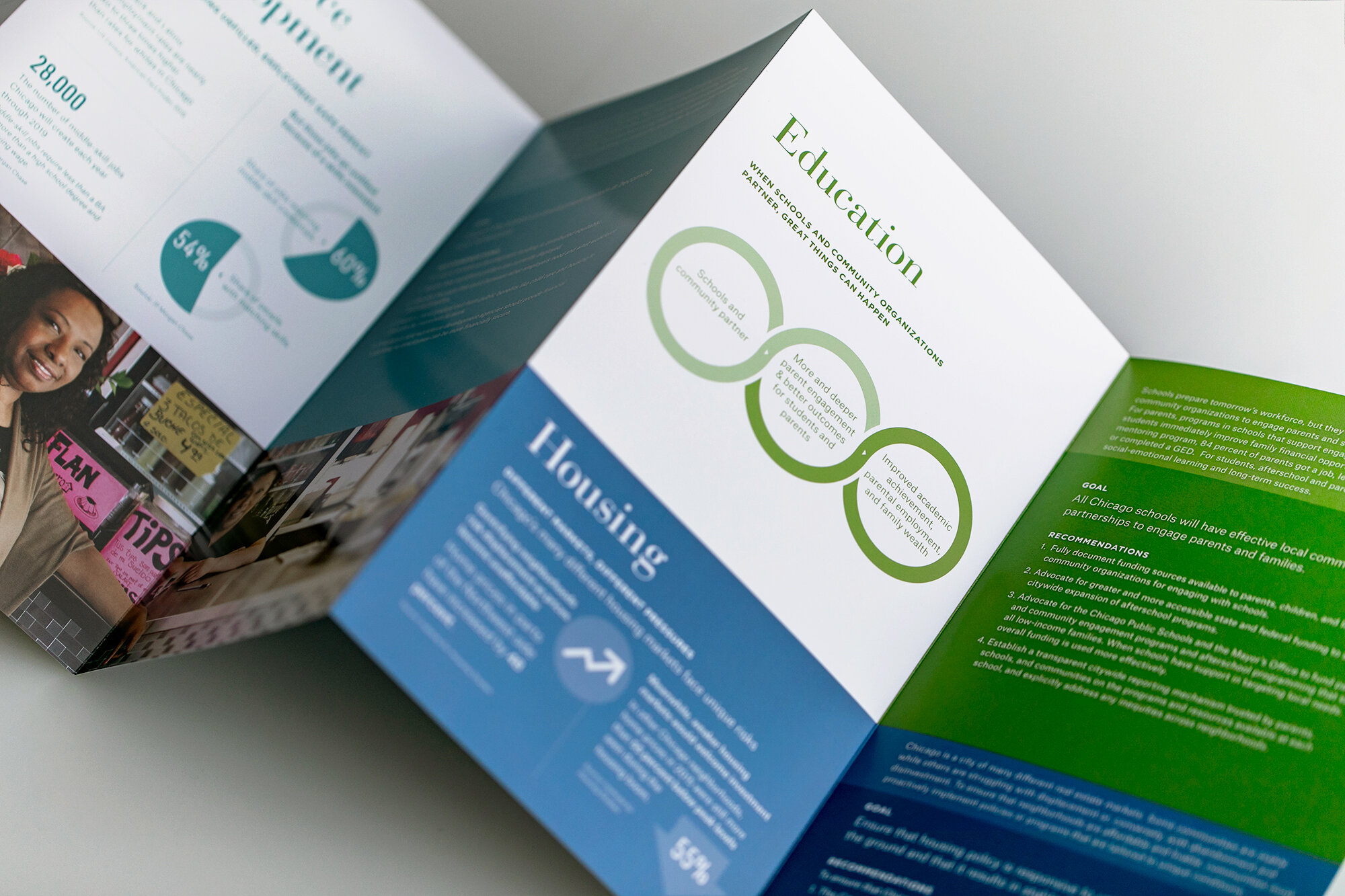
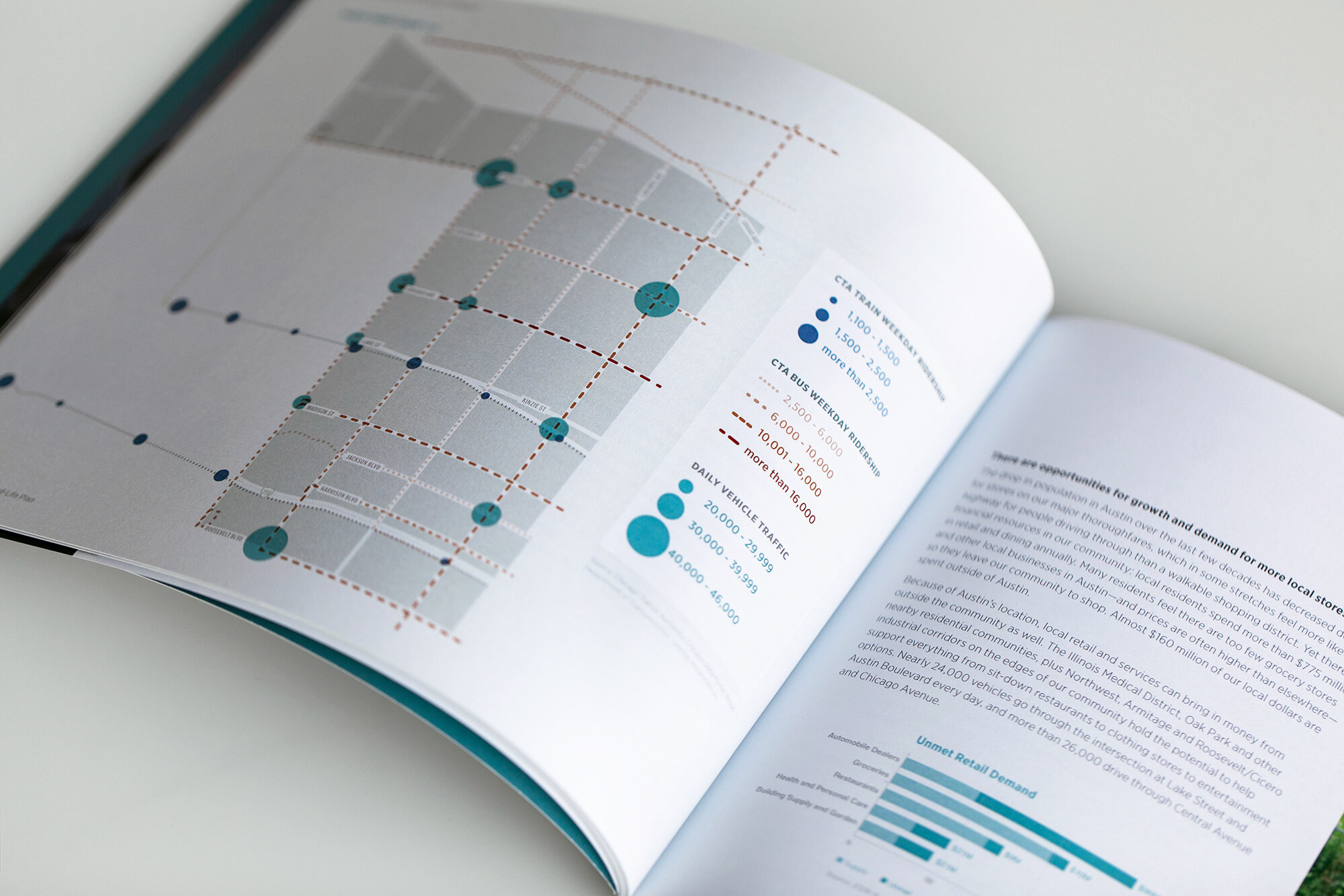
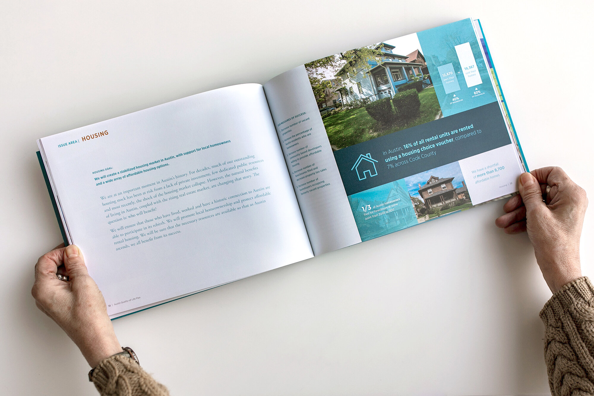
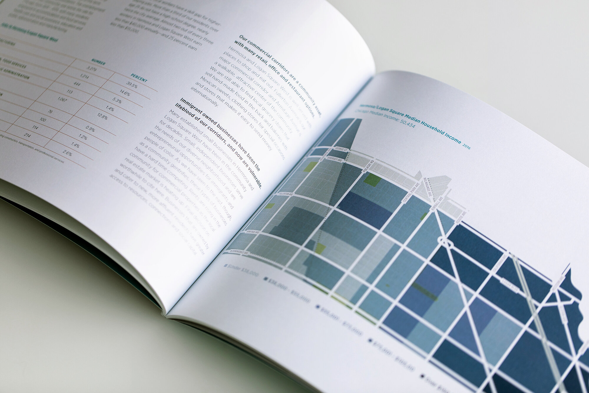
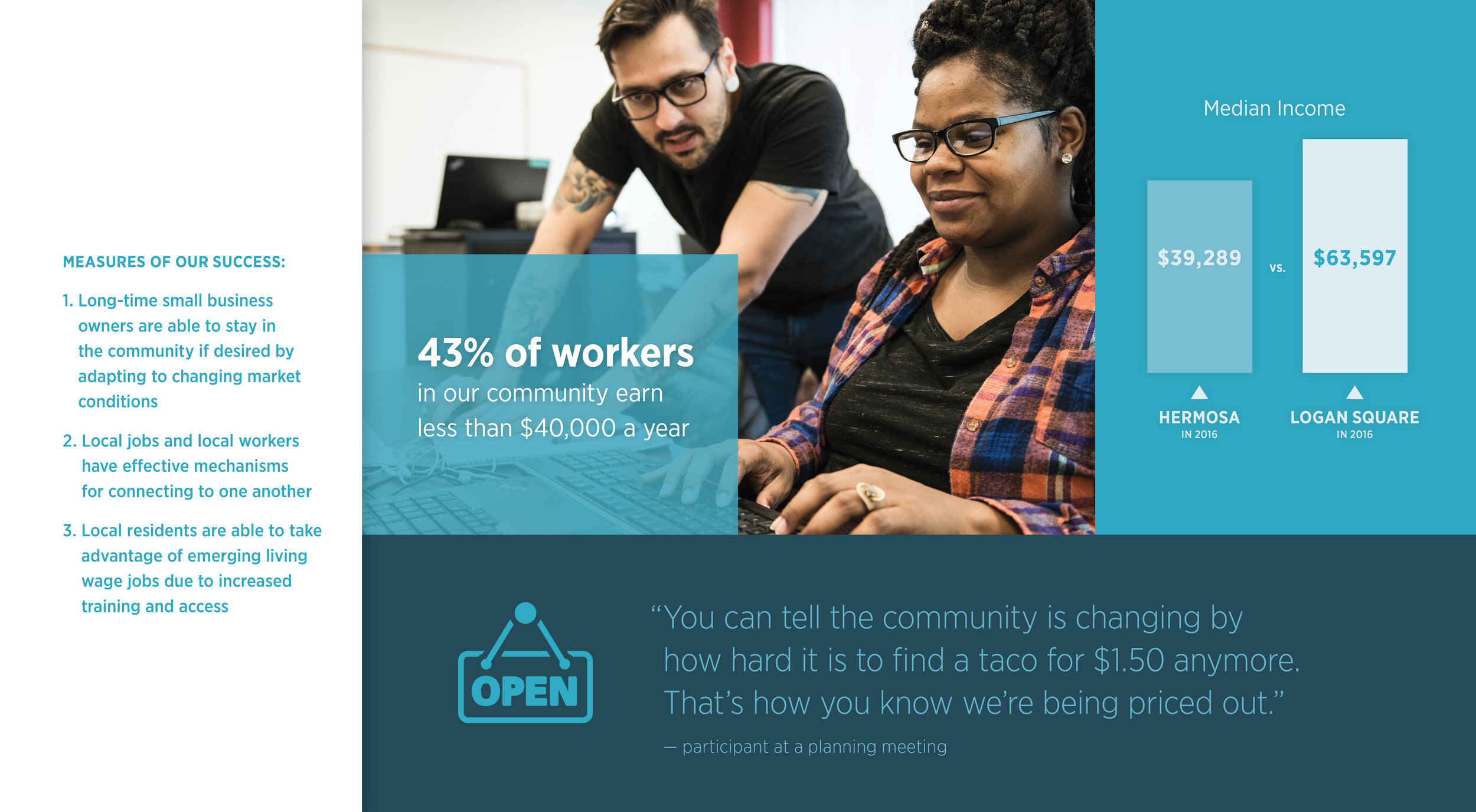
You guessed it, data was put front and center in these plans. We took dry information and performed a little design magic in each of the 60+ page reports outlining future plans for our fellow Chicagoans. You see, at the beginning of each chapter, we created mosaics to visually summarize the chapters that followed. Then, designed maps and charts throughout the booklets to help support their content that was essentially written by the community in interviews and information gathering sessions that all led to the final plans. These graphics helped break up the dense chapters and allowed for easier digestion of content for the reader!
Truly, a win win!
With infographics, less is more. Say it with us!
what can we remove?
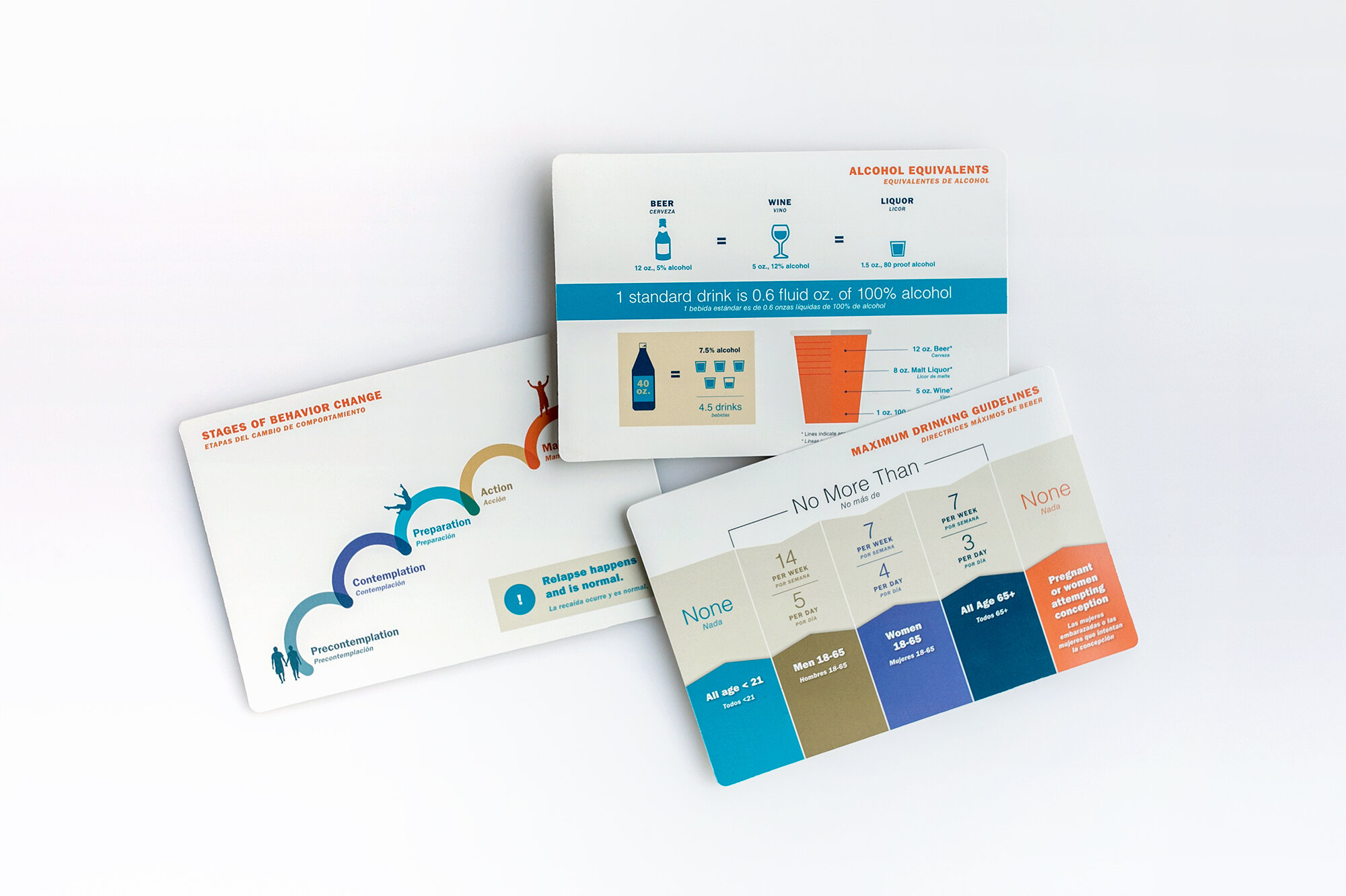
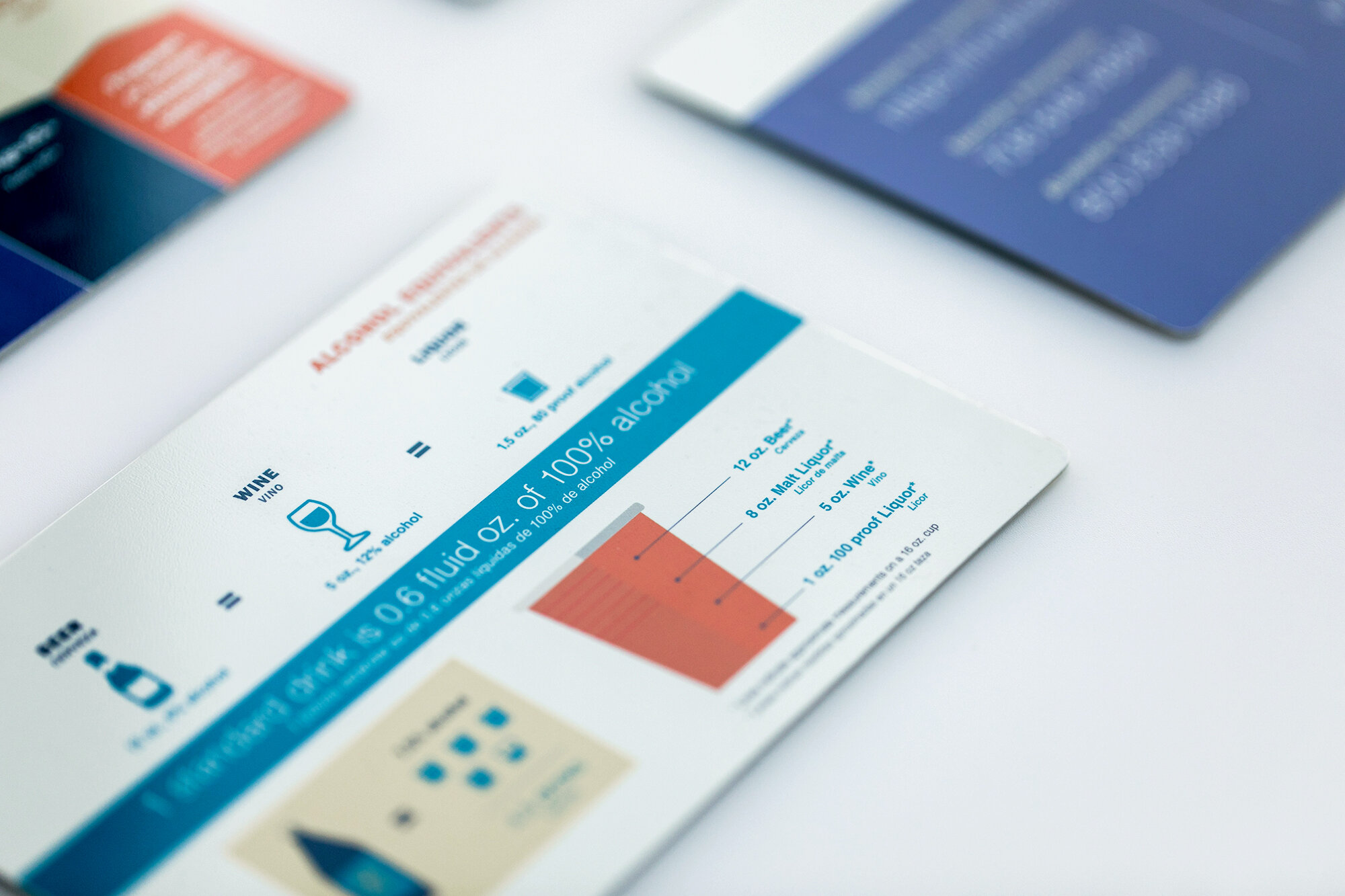
This is always our first question when embarking on an infographic with a client. In this case, we worked with ACCESS Community Health Network to create these cards for their medical providers. Putting the effort into these graphics to design them as simple and easily scannable as possible was more important than ever so we could better support the community they serve.
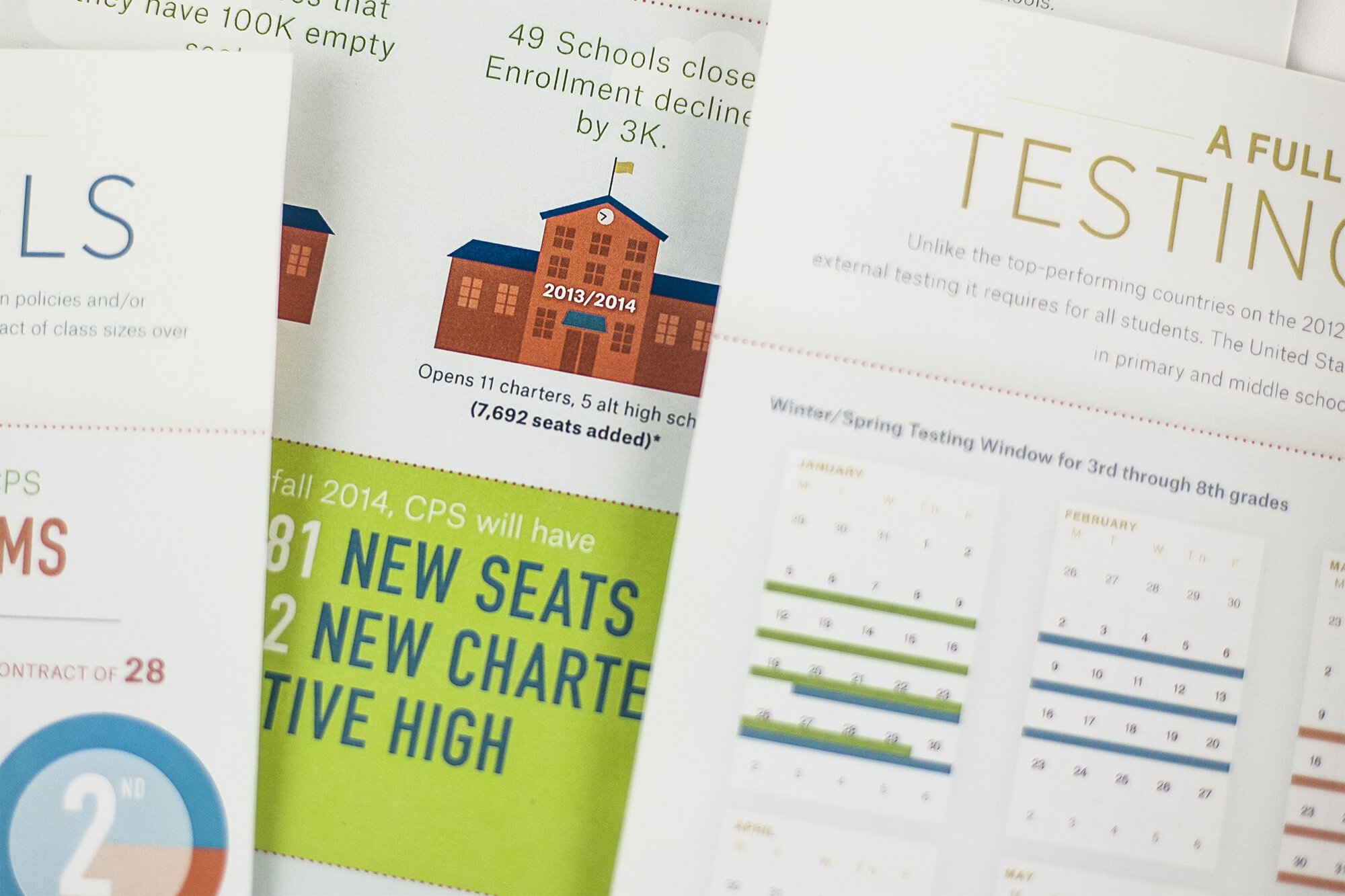
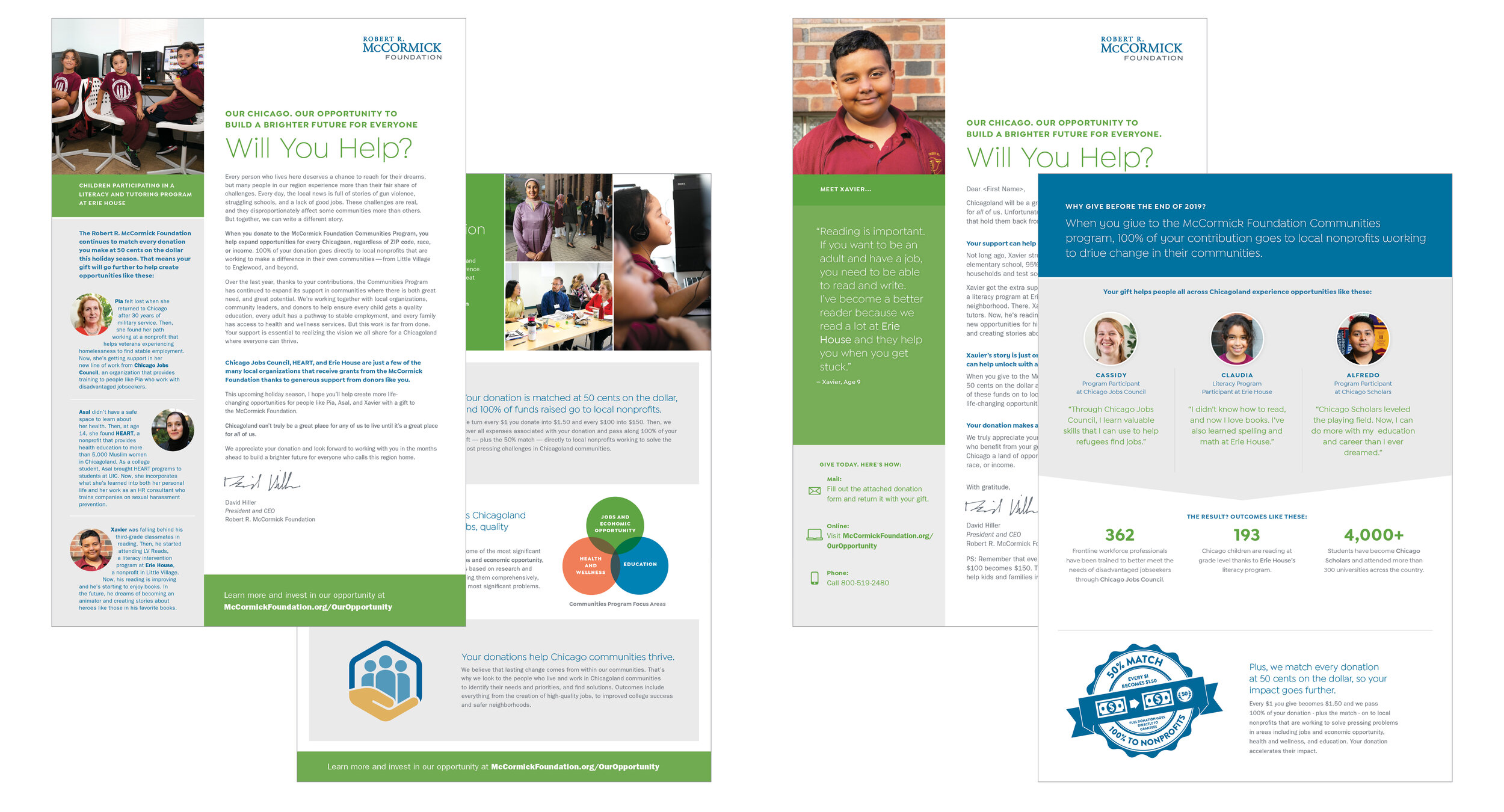
Information design really is at the root of all that we do. Even these annual appeal letters for the venerable McCormick Foundation found a way to be more visual!
Long story short, a good infographic can help you say more with less.
Thanks for following along on our trip down memory lane. Don’t hesitate to reach out if you would like to see more of these graphics or have a project in mind that could use some sprucing up.
Let’s get to work!


