The Fieldhouse Report, fresh off the presses!
This past year has been hard for so many. Among all of the wild events we all have been grounded physically and, in many ways, mentally. Here at Forward we have tried to keep our spirits up in some way and turned to our pet project: fieldhousestories.com.
The brief
A few years back, we designed a website to highlight various Chicago Park District fieldhouses that we explored. It is a collection of photographs and stories from the people who run the fieldhouses, those that attend classes and friends of the parks. Originally this project was a way to get OUT OF THE OFFICE and find inspiration locally. But, it turned into so much more. It was a way to learn more about our city, explore these hidden gems and experience new neighborhoods. In true 2020 fashion, the pandemic put our project on hold.
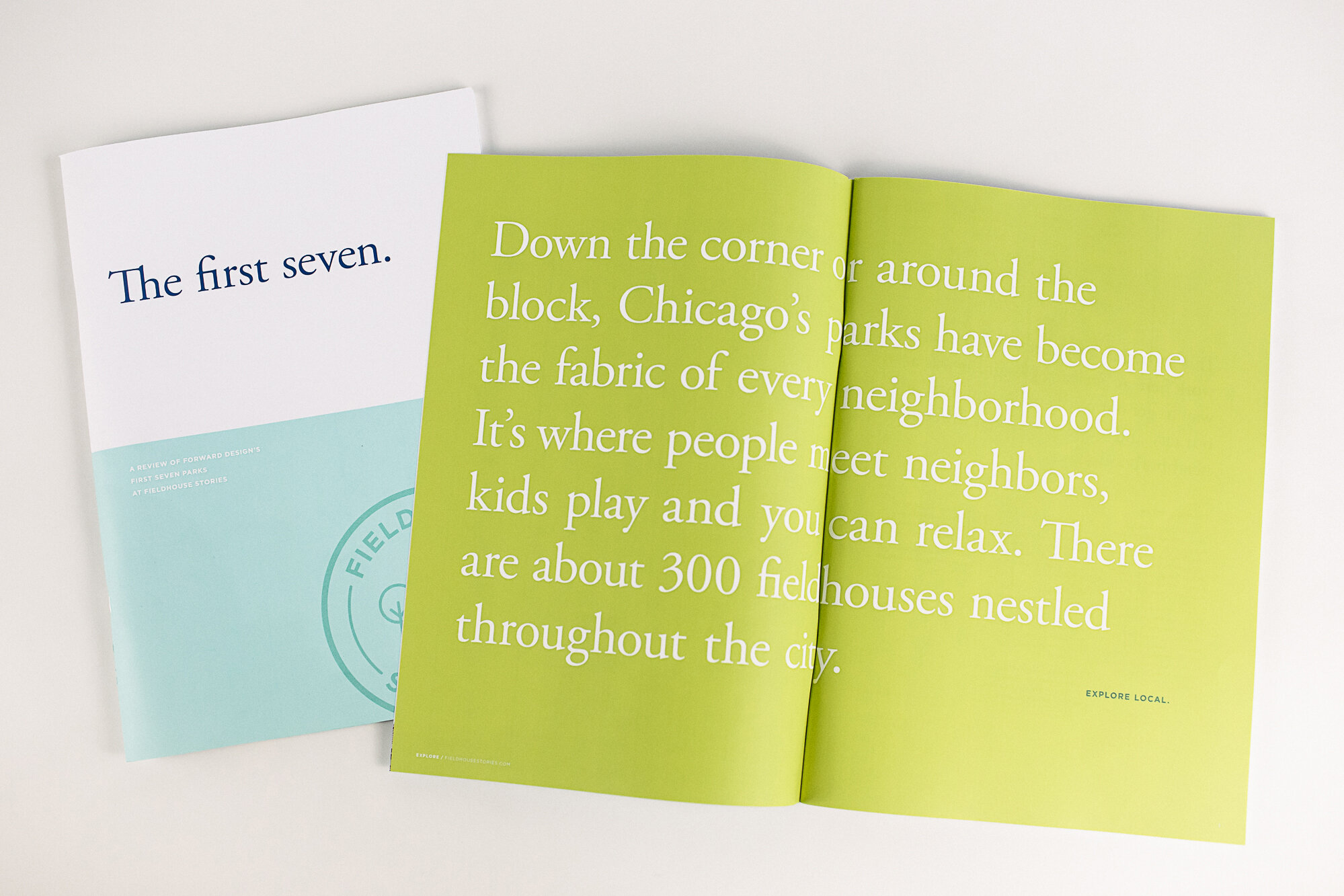
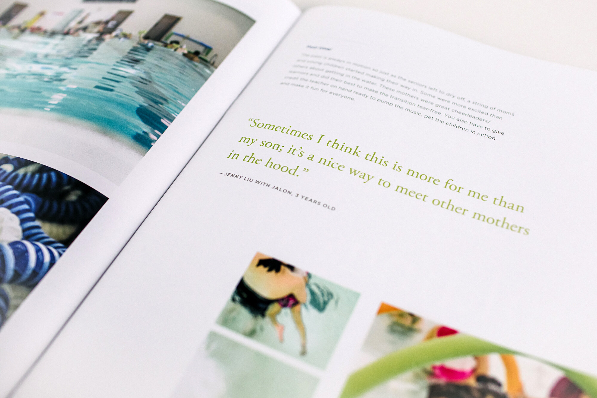
While Fieldhouse Stories began as a branding and website design project, we decided to use our “pandemic time” to create a fresh new publication that is 84 pages strong. With that, the cat is out of the bag, we designed a retrospective of the first seven Fieldhouse Stories.
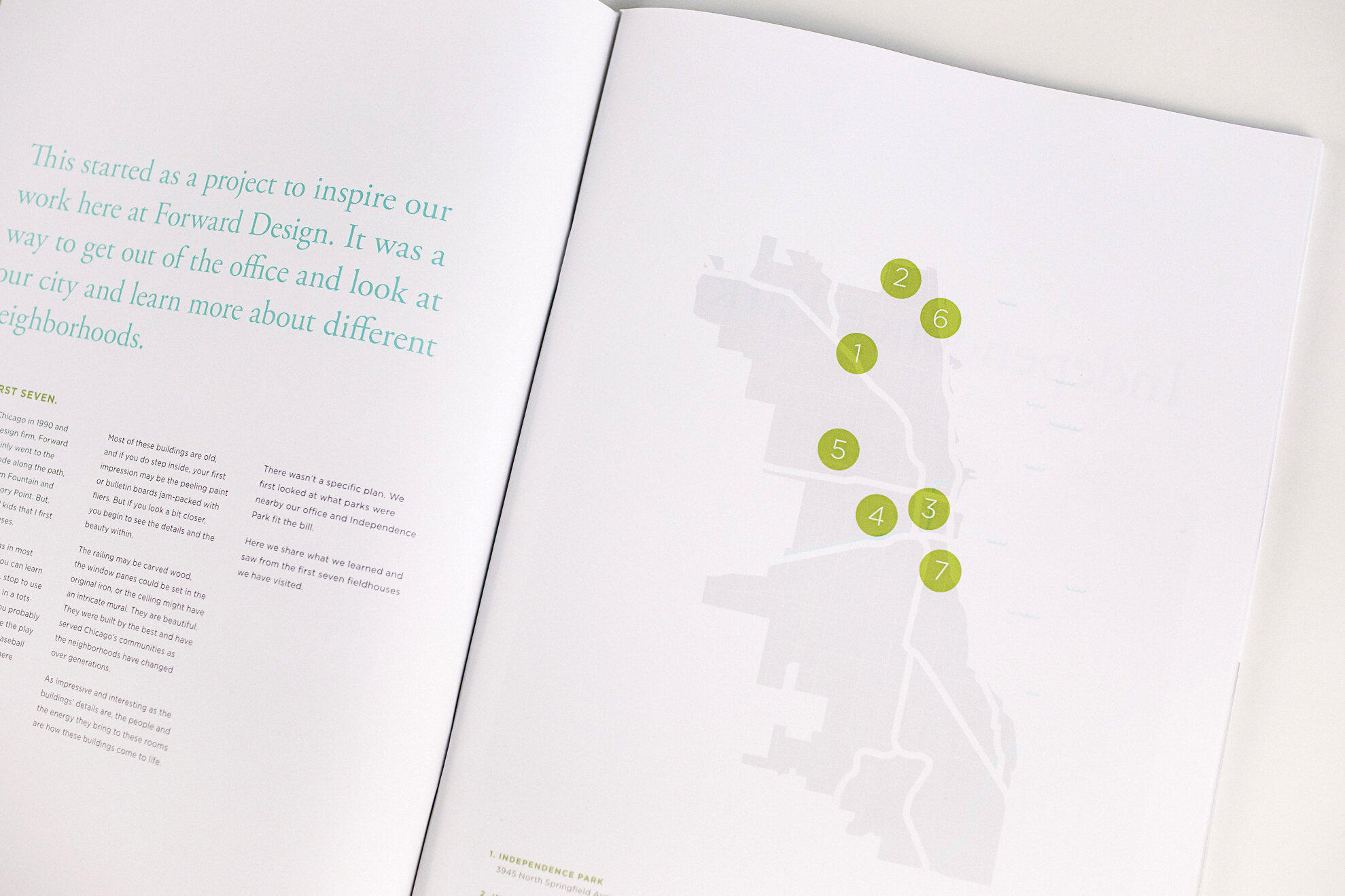
“We wanted to explore how we could expand the brand from the web to the printed page. The design of this publication stayed true to the site design with a few added maps and some new iconography; we couldn’t be happier with how it turned out. ”
set the pace
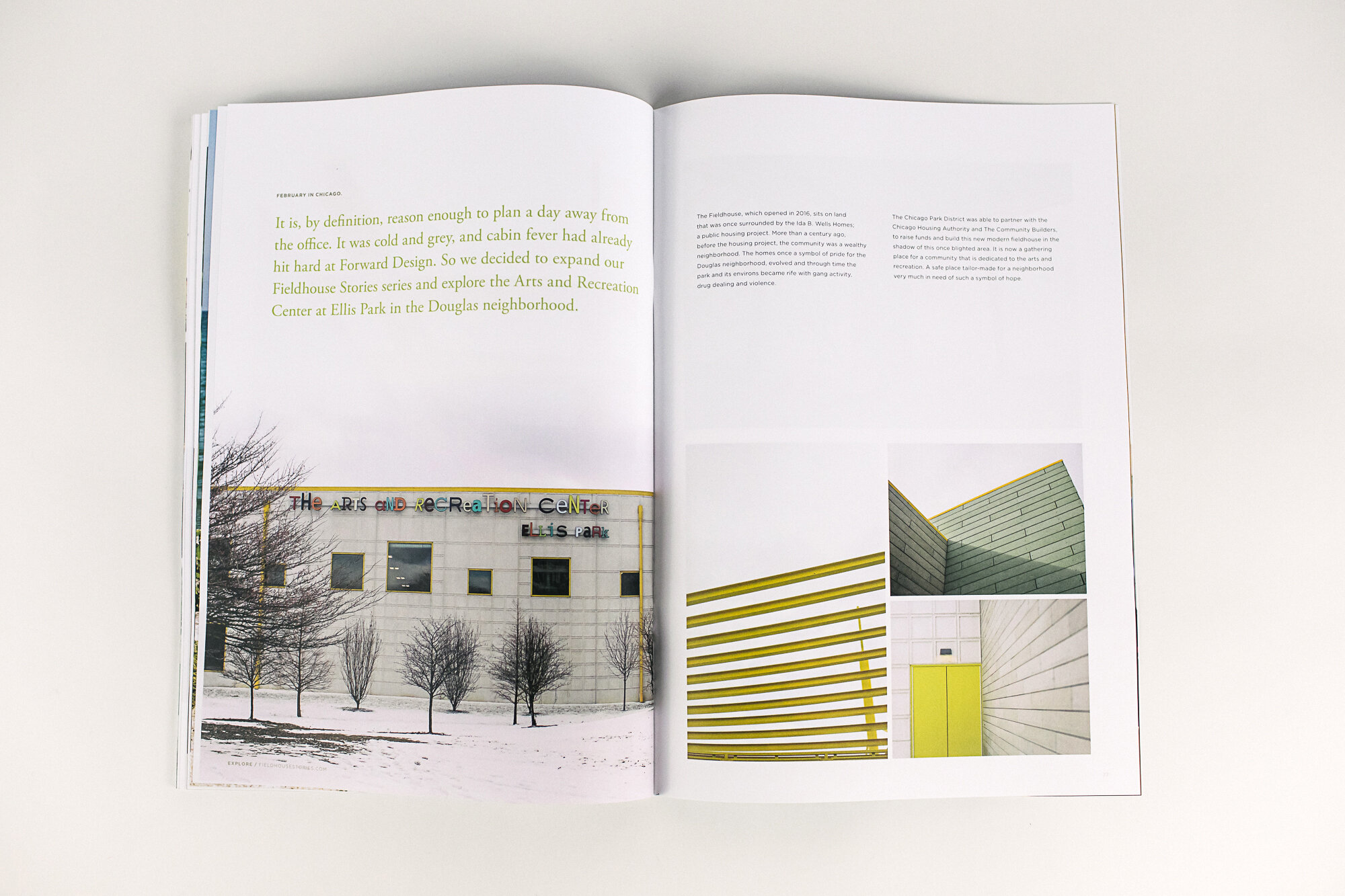
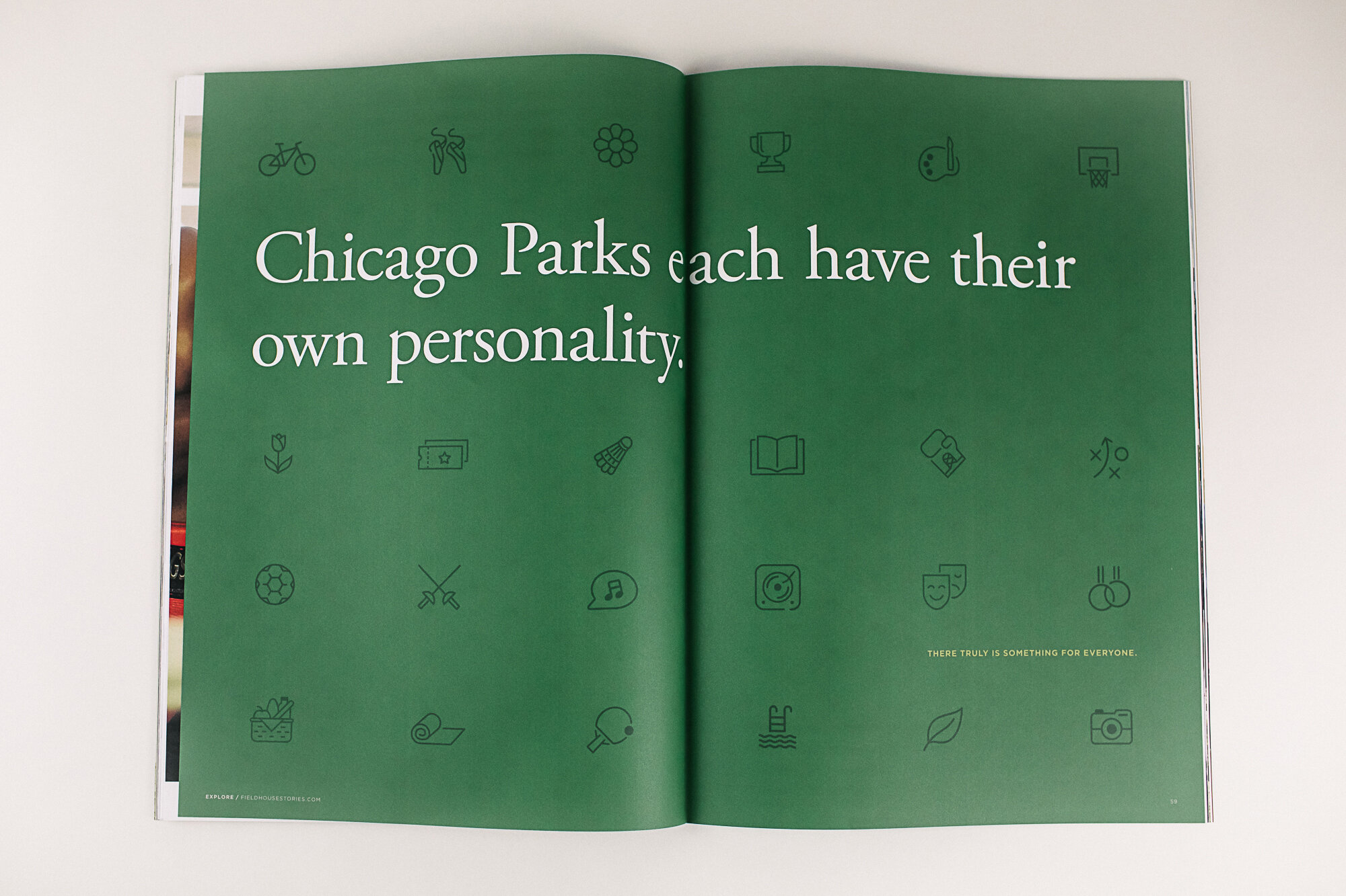
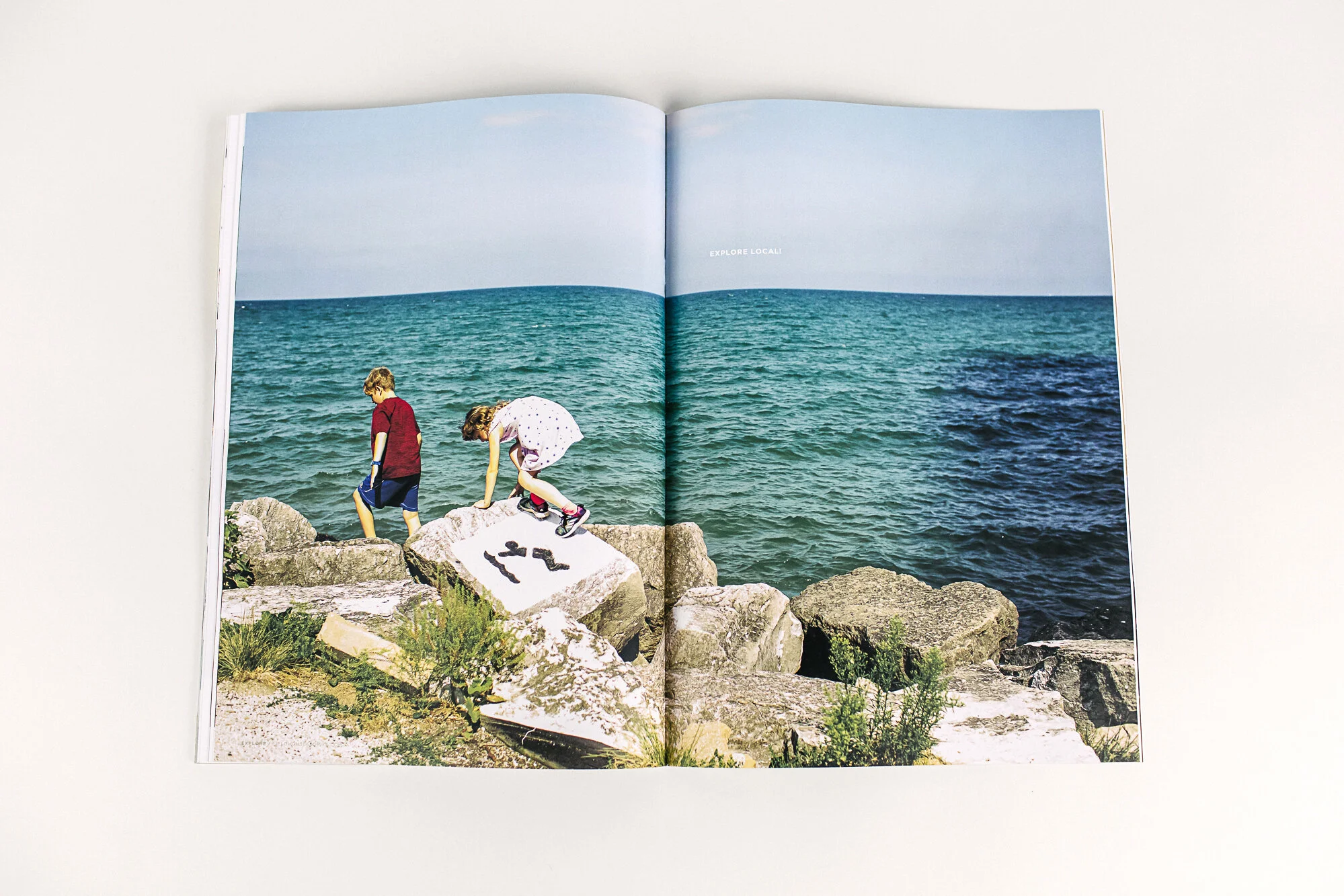
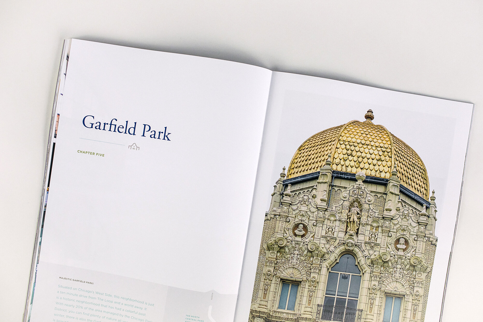
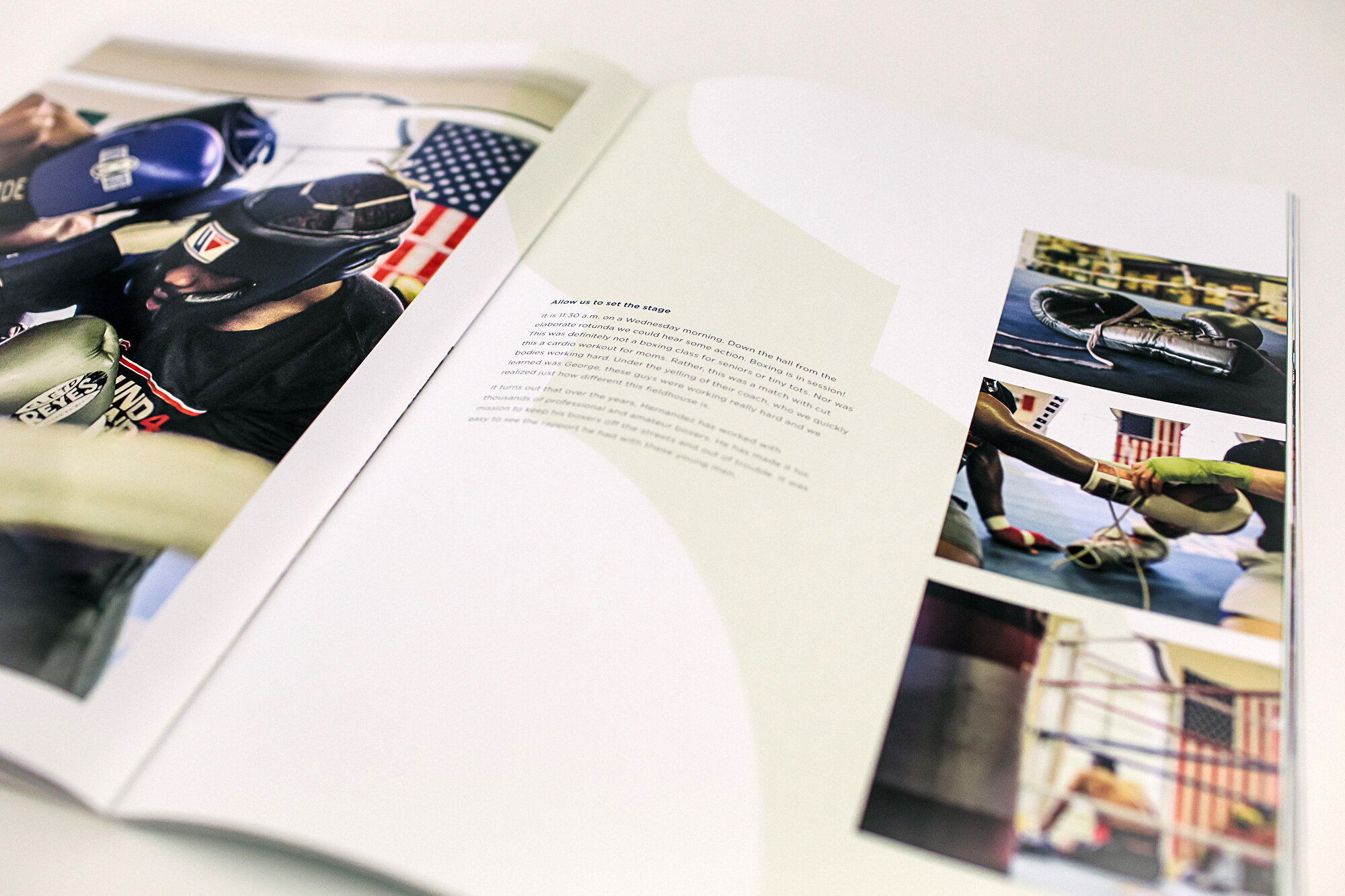
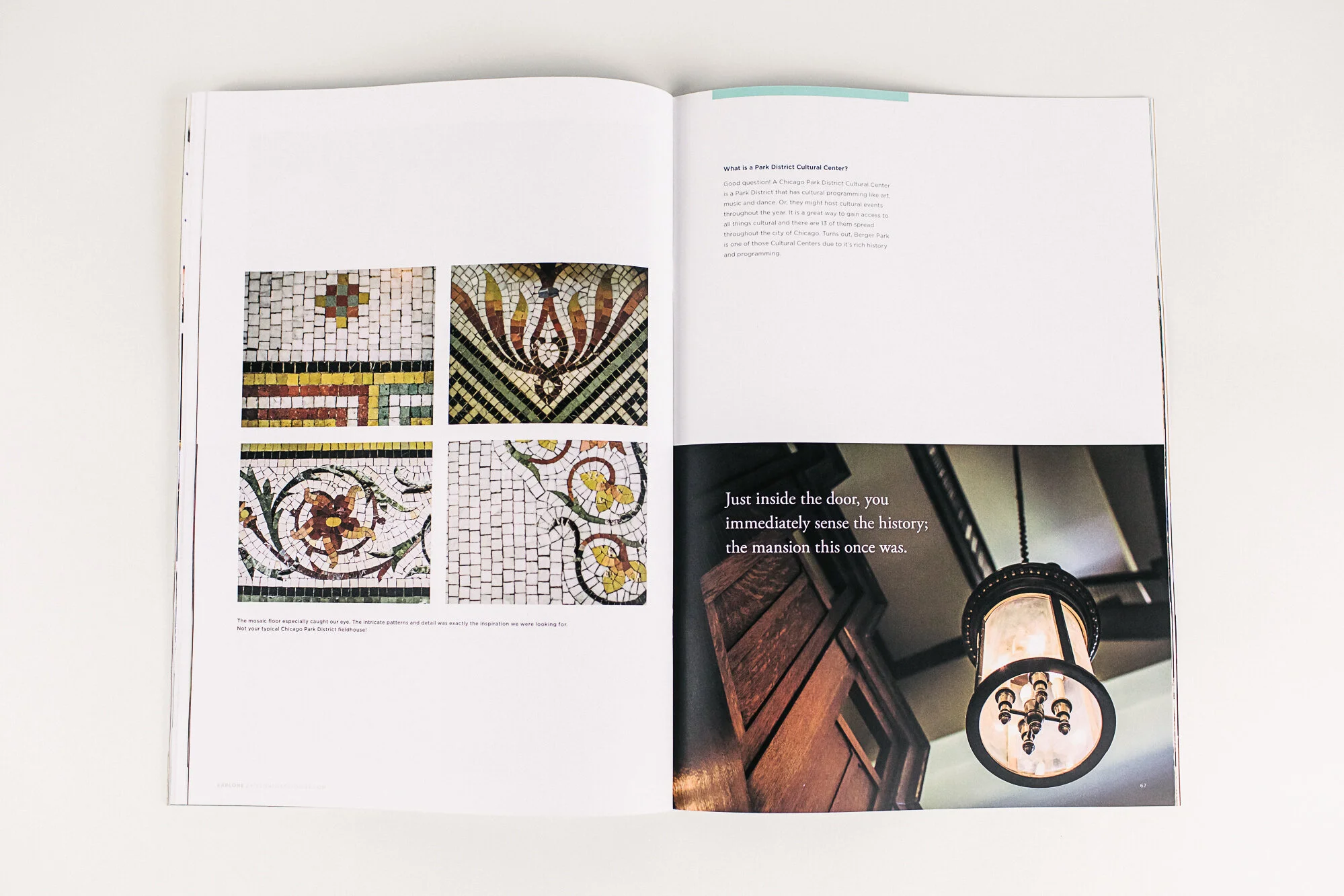
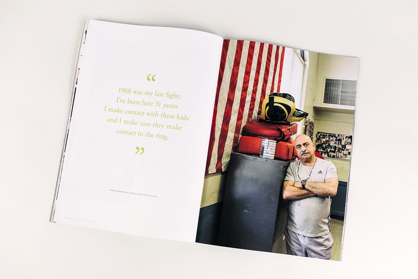
Design is based on decisions made. We are always asking questions: who is the audience, how will the message be delivered, what is the user experience? In this case we have an oversized brochure that someone will be holding and flipping through. This is very different than scrolling through the website and decisions had to be made to make this successful on the printed page. Our approach was to design full color spreads that interrupted the chapters, to cue the reader of a new story, new fieldhouse. We also played with different sizes of type that further outlines the content for the reader experience.
A new perspective
Our work is based on the relationship between our clients and the goals of any particular project. This was such a great experience because here we were our own client! Without any outside restraints, it’s a bit like being a kid in a candy store and very overwhelming. In the end, designing this publication was all about digging deep in our process as we do for our clients: asking the what, why and how questions. And as a bonus we gained some empathy for how our clients feel.
Custom icons!
Finding inspiration in the details is something we come by naturally as designers here at Forward Design. So, it only made sense that we wanted to portray each Fieldhouse in their own unique way in an icon. We found inspiration in the porticos, columns or the simple outlines of the fieldhouses themselves. Whatever it was, we found the beauty in each of these buildings.
It is all part of the Fieldhouse Story.
Design is fluid
We loved taking this time to flex the Fieldhouse brand further and play with elements within the website to bring it to this oversized publication. As always, thinking through the user experience of how someone explores a website is so different than flipping through a brochure, but is all part of the design thinking that goes into our work here at Forward Design. We are always up for the challenge.
Long story short, a good design foundation can expand its reach and elevate brand.


